Some renovations truly transform a space. And that is exactly what happened inside this London, Ontario home. With a closed off layout and dark fixtures and finishes, the interior of this home didn’t have much appeal and certainly didn’t match the astonishing property overlooking the river.
“When our client first called us into this project, the home had a very institutional feel to it. It almost felt like we were walking into a 1990’s bank lobby.” Luke from V+V Homes says.
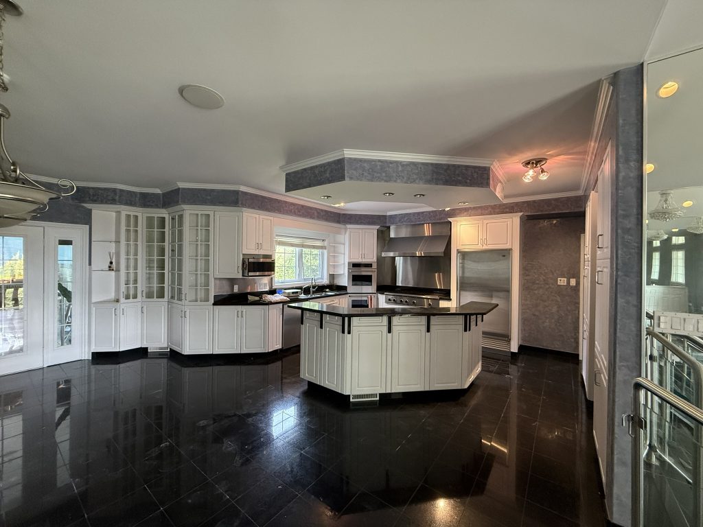
Looking at the before pictures, it is hard to imagine that this home used to look the way it did. Floor-to-ceiling mirrors, black floors, and outdated white cabinetry crowded the foyer and upper level. Lights hung much too low and there was not any real flow into the adjoining rooms.
“And [that’s when] we pulled in Ava from Braam’s to help us reimagine the space.”
The team made the decision to strip the interior down to the studs. Mirrors were removed, black tiles were torn up, and all the cabinetry donated to make room for something entirely brand new. With a focus on classic finishes and a more symmetrical design, this London home was brought back to life.
Definition and Symmetry
That sense of balance shaped both the architectural decisions and the millwork detailing.
“The symmetry was actually very important in [the main areas of the house],” Ava describes, “Symmetry just has something about it that makes a space just feel so comfortable for the eye to look at.”
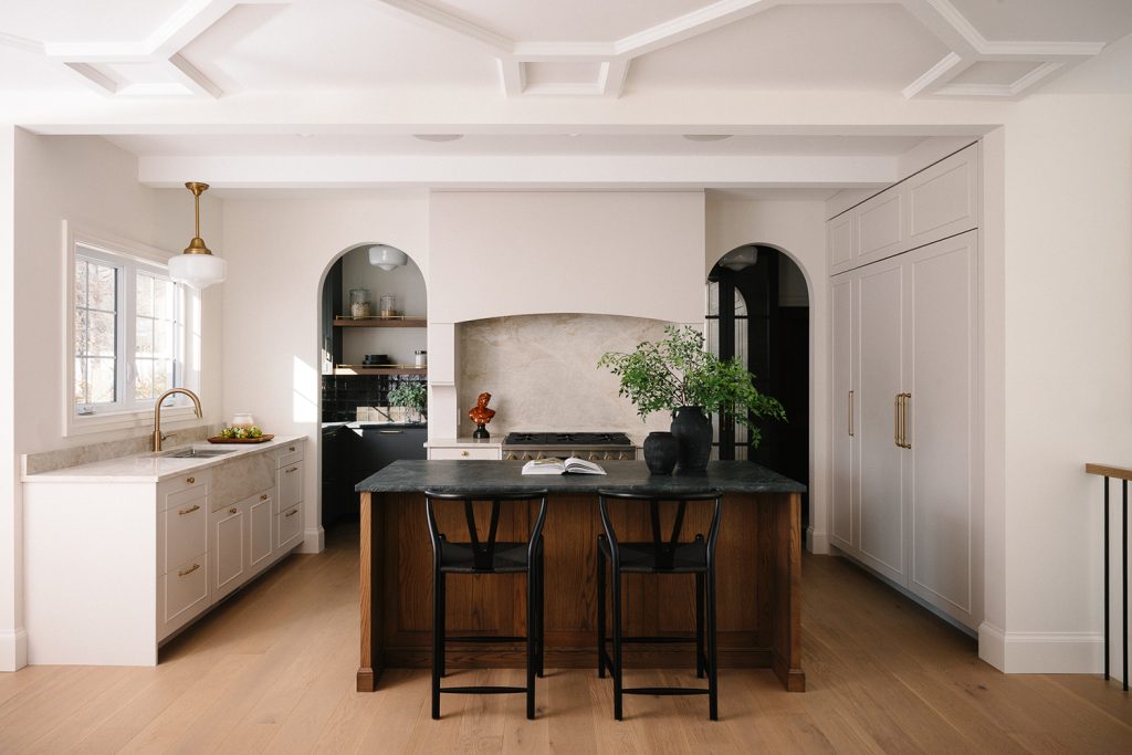
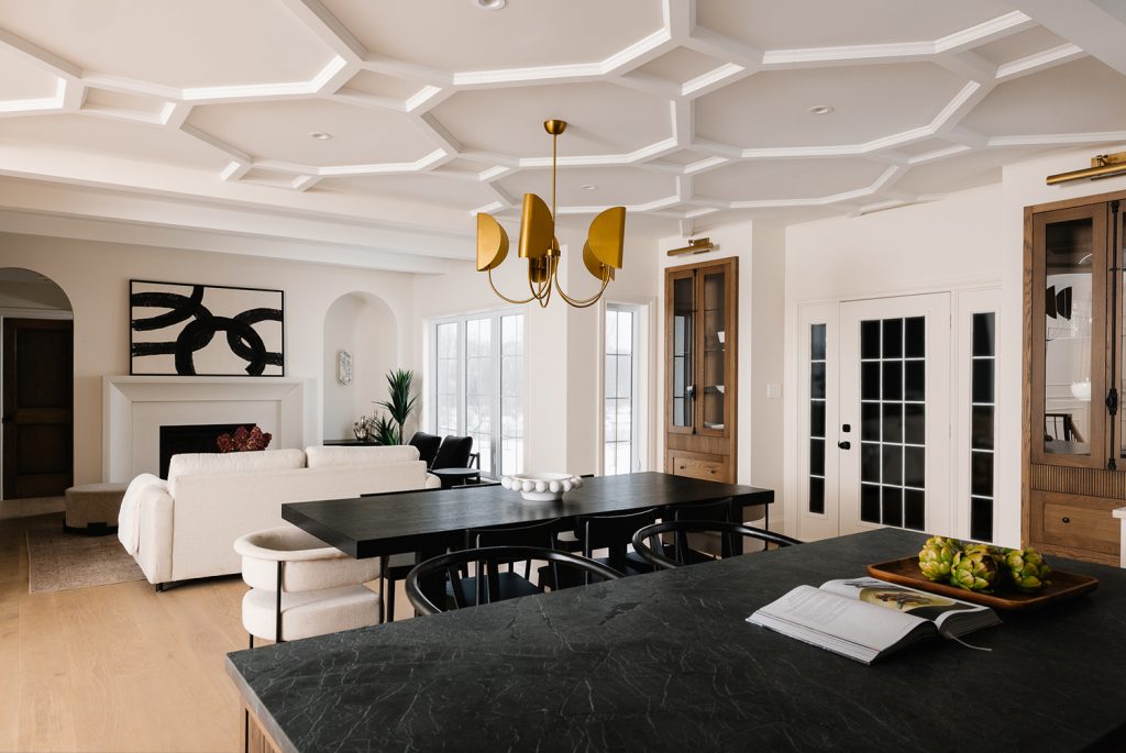
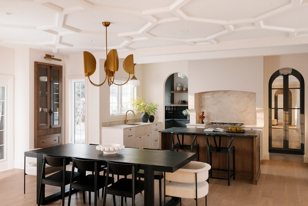
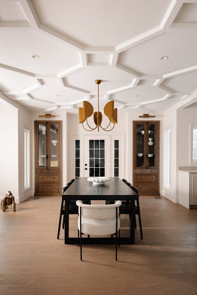
The result is a home that feels intentional and effortlessly balanced. Identical arches on either side of the range are mirrored in the living room. Twin hutch cabinets are recessed into the walls of the dining room with matching glass cabinetry and reeded accents. The theme of symmetry continues overhead where an intricate design spans the dining room and equally spaced beams extend over both the kitchen and living room. Beyond its visual impact, the ceiling helps subtly define each zone within the open concept layout.
As Ava explains, “We wanted the home to still feel structured. We utilized this beautiful ceiling design to create separation, so it has a defined kitchen, dining space, and living area.”
The Open Concept
With off white perimeter cabinetry, a custom range hood with corbel details, and a white oak island with subtle texture, the kitchen is one of the more memorable spaces in the home. Arches bookend the range, framing the oversized hood that is set against a striking Taj Mahal backsplash. Honey bronze cabinet hardware highlights the soft amber and taupe veining, while the flat cut white oak island anchors the space. The natural grain of the wood island and the subtle reeded panels on each side add dimension and interest without taking away from the aesthetic. A paneled refrigerator and dishwasher help maintain the kitchen’s cohesive appearance, while hidden features such as an outlet tucked behind a small flip down door add everyday functionality.
“The original cabinetry wasn’t very functional, it wasn’t very high quality, it just kind of crowded the space both physically and visually,” Luke says, “By eliminating that, finding a space for everything functional so it does all have a home, we’re eliminating visual clutter and now it feels a lot more useful, elegant, and refined.”
Beauty and practicality are carried into the dining room. Two matching white oak hutch cabinets with glass doors and reeded details flank each side of the entryway into the back of the house. These built-ins not only match the kitchen island but provide essential storage for the dining room.
“The hutch cabinets serve the dining area so a lot of the dishes and the other things actually related to dining will be right across from the table for easy access,” explains Ava.
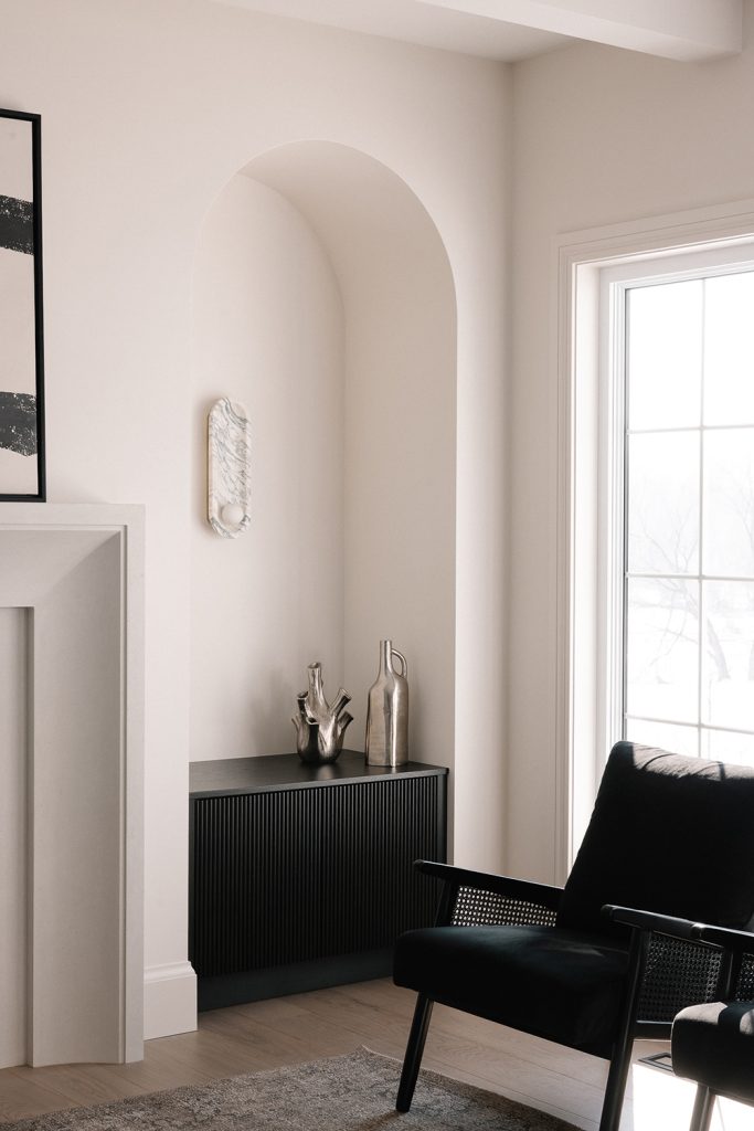
The living room acts as the final part of the open concept space, offering an area of comfort and relaxation. A large window overlooking the property sits adjacent to a decorative arch which mirrors not only the arches in the kitchen but also the arched opening into the hallway. A small black cabinet tucked within the decorative arch provides additional storge while an elegant fireplace sits in between the two openings.
The Spaces Beyond
While the kitchen, dining area, and living room open concept space sets the tone, other pieces of the home continue the theme but through a more functional lens.
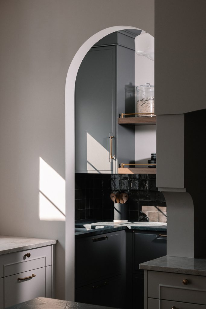
On either side of the range are two arches that lead into a pantry space. The pantry, painted in striking charcoal, contrasts beautifully with the white kitchen cabinets. A dark textured countertop, open shelves, and plenty of lower cabinet storage provide both storage and preparation space.
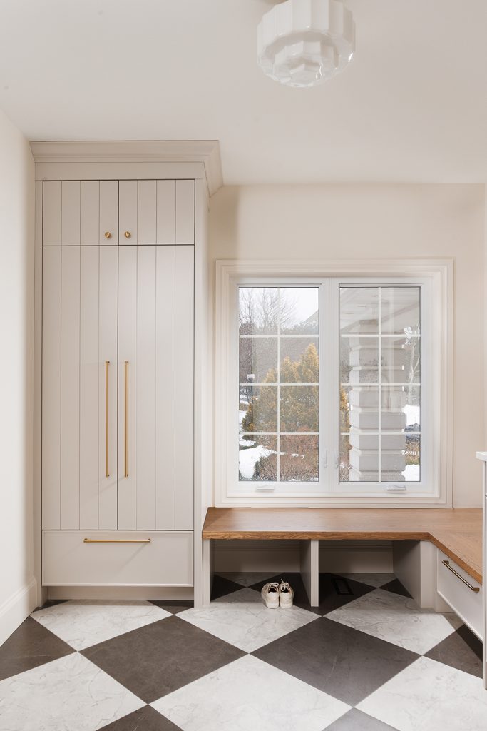
Directly next to the pantry area is the mudroom and laundry combination space. With the original design of the home having no mudroom and a very small laundry room, adding a bigger and more functional mudroom and laundry was paramount. A tall closet cabinet, a bench with open storage beneath, and a hanging rod for drying delicates completes this space.
Design Forward
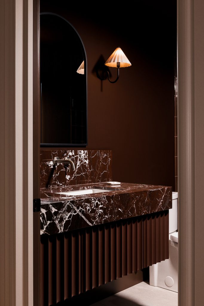
Though practicality drove the design of the pantry, mudroom, and laundry, the powder room embraces a more design forward approach. Inspired by the red and white marble atop the vanity, the room was colour drenched in a rich mahogany brown. A small floating vanity features sleek scallop detailing to add subtle movement to the space, complementing the lightly textured shower tiles.
“We wanted to do a little bit of a pop of colour,” says Ava, “and we chose the powder room as the area to do that. We chose to colour drench the room with the paint and the shower tiles. Add in all the cool little textures on the scalloped vanity and the shower tiles just makes it look so unique.”
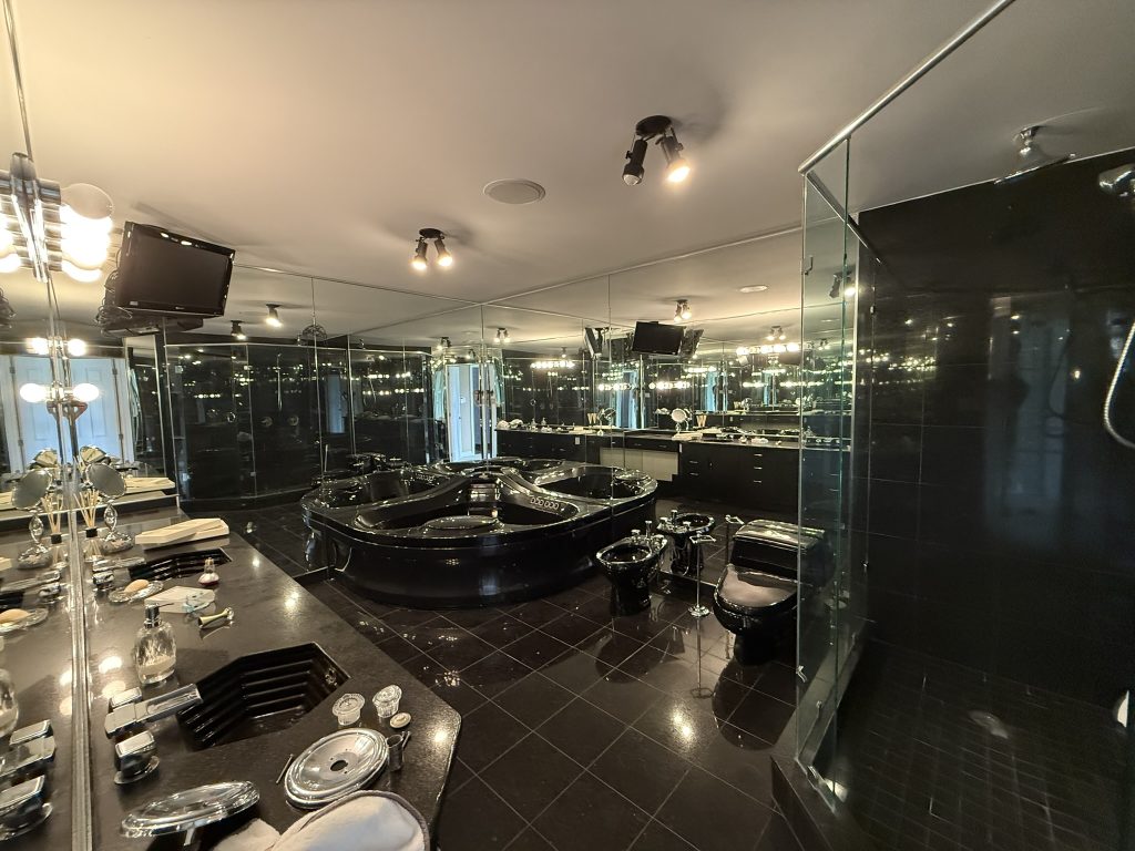
As striking as the home’s more frequented areas are, nothing is quite as astonishing as the transformation of the primary ensuite. Like the rest of the original home, the ensuite was terribly outdated with dark fixtures and an odd layout.
As Luke explains,
“The ensuite itself had a Scarface feel to it. We had black granite floors and all black fixtures like a black jacuzzi tub, black toilet, black bidet, black shower floor, black shower walls, black vanity and black sinks. There were mirrors lining the entire room and there was not a single window in this dark, closed off ensuite.”
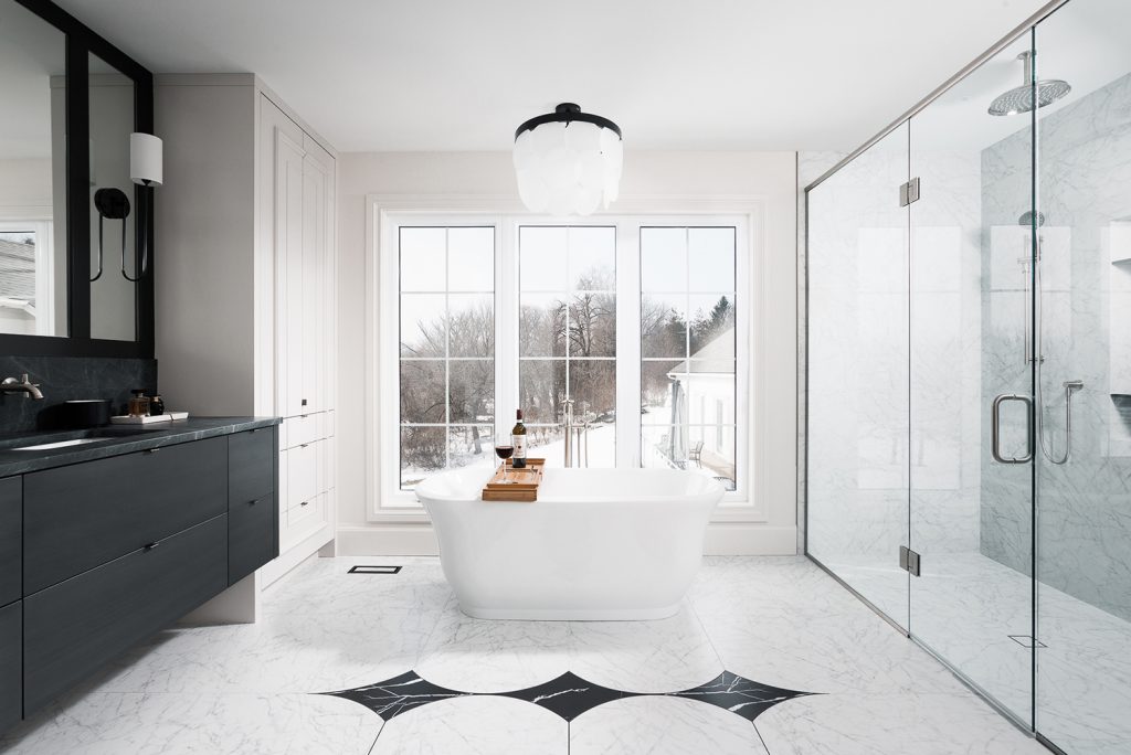
Bringing light into the ensuite was priority number one so a window opening was cut in, allowing for a spectacular view of the river flowing through the backyard. White painted walls replaced the floor to ceiling mirrors and a custom inlaid stone floor was installed. A free-standing tub is nestled between the glass shower and tall storage cabinet with a dark stained vanity finishing the space.
What started as a home that felt dark and disconnected was transformed into a space that feels welcoming and intentional. From the architectural details throughout every room to the fully reconfigured floor plan, every piece of this home is the perfect blend of function and style. The result is a home that is both effortlessly chic and seamlessly intuitive.